Welcome back to my blog on my journey to my own clock widget. Writing this post about layouts and resources was way more difficult then I anticipated. Resource handling and internationalization and localization (i18n and l8n) are such broad topics that I can barely scratch the surface of it all in a single post. Still I hope that I can give you a small inside into the process. So lets dive into today's post and talk about the layout.
Overview
Today I will explain the layout and along the way talk a bit about how android handles resources like images and strings. Further I will try to show how the declarative approach allows to define different resources depending on the country, the screen size and many more things. After this post you should be able to create your own layouts for different languages and screen sizes and understand how to interact with your layout from code.
Resource Selectors
The android world consists of many different devices with different screen densities, sizes and memory footprint. Further more if you release an app into this ecosystem and you want to compete on a global market with hundreds of different languages and type faces you need a way to define your UIs in a way that allows to compensate for these different configurations to bring the best user experience to your app. In android this is realized by externalizing resources like strings, dimensions, images, animation, etc. into separate files and providing mechanisms to select them based on qualifiers defining the different configurations.
Android distinguishes between default and alternative resources. Default resources are either device independent or represent the least common denominator for all platforms. Alternative resources are grouped according to the specific configuration they are designed for. When a resource is requested from the OS it is looked up in the folder with the most specific matching configuration falling back to the lesser specific once. If no match is found the default resource is used.
Resources are put under the res folder in one of the sub folders depending on the type of the resource:
- layouts go into the layout sub folder
- the values subfolder takes strings, colors and dimension files
- the menu sub folder takes menu definitions
- drawable takes image resources
- the xml sub folder takes arbitrary xml files containing meta data like app widget provider meta data
To specify a configuration a qualifier designating the configuration is appended with a hyphen to the folder name:
<folder name>-<qualifier>. Qualifiers can be composed to create more specific configuration. Android always selects the most specific configuration based on the context of the used resource. A complete list of available qualifiers can be found in table 2 at Providing Resources|Android Developers. The order in which the qualifiers are composed has to correspond to the order they are given in the table or else Android will ignore the given folder. You will see the usage of qualifiers in the context of using image resources.
A special case for the use of the qualifiers is internationalization (I18N) and localisation (L10N). I18N and L10N is realized by appending the country code and/or the language code to the values sub folder. I will give an example in the "Defining Text" section on their usage.
The Layout
Layouts
As android has to support many different screen densities and sizes it is essential that the layout system can adapt. For this purpose android provides a predefined set of Layouts. These are exposed either through code or in the form of xml tags. The xml tags are inflated to the corresponding classes before display. No matter how you define the layout it is the job of the layout to adapt its elements to the screen. Depending on the layout the strategy for this adaption is different.
Layouts can be nested to produce more complex layouts but be careful the more complex the hierarchy gets the longer it takes android to display it. Always try to keep the hierarchy as flat as possible to improve performance and keep your UI responsive.
Some of the layouts available are
- LinearLayout - displays its content as a horizontal or vertical single row
- GridLayout - displays its content in a grid
- FrameLayout - displays its content a single frame with predefined anchor points. This layout is intended to display only one child but it can be used to stack children on top of each other.
- RelativeLayout - displays its content in accordance to their relative layout declarations.
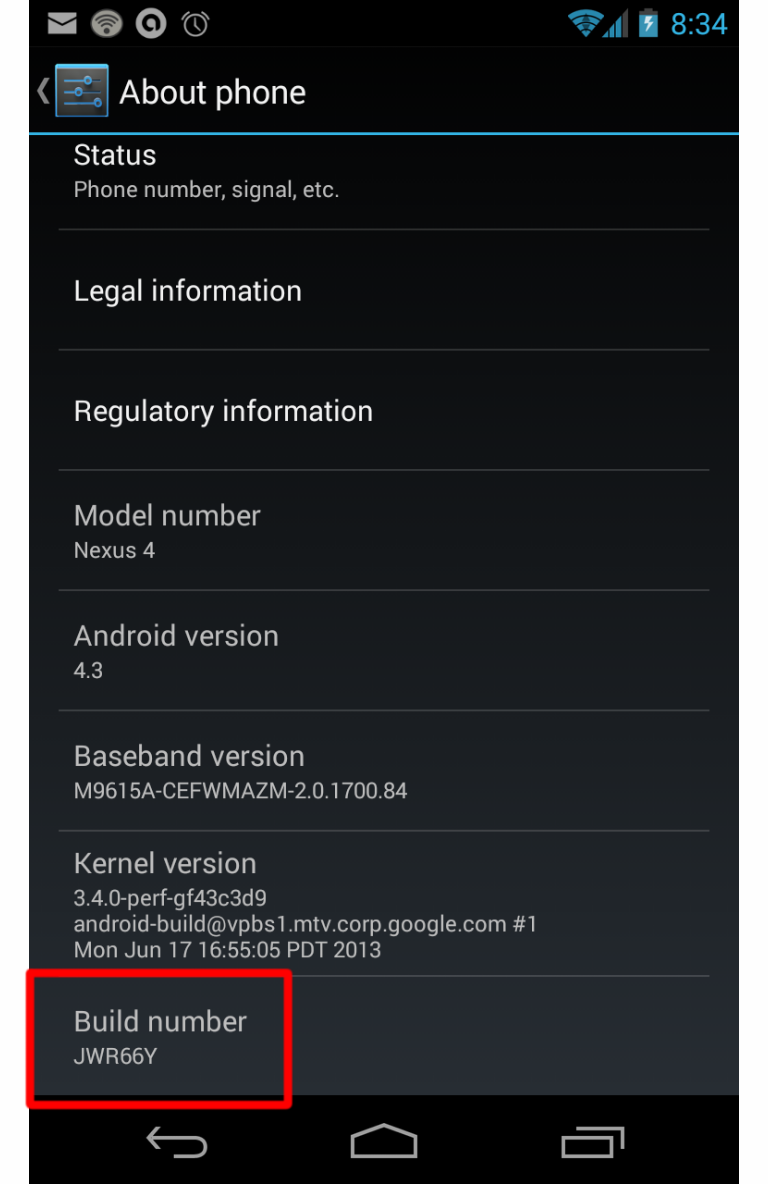
The xml file contains the used layout as the top element and the child elements that make up your screen. For now I will simply define one layout and size it in a way so that it works on the screen of a Nexus 4. (The Nexus 4 has a 4,7" display with a pixel density of 320dpi)
The first thing to decide is which layout to use for the UI. As I'm planning a complex UI with elements that overlay on top of each others I either have to use a frame layout or a relative layout. I chose the relative layout which allows me to position individual elements in relation to each other making it unnecessary to use nested layouts while giving me complete control over each element's position. The disadvantage of this approach is that I have to specify the sizes so that the overlay works properly.
To make things easy I start with just the analog clock element added to the layout. The analog clock element provides the means to show a completely functional analog clock with customized hours, minutes arms and a custom dial. If not specified android uses the system default drawable resources for minute, hand and dial.
<?xml version="1.0" encoding="utf-8"?>
<RelativeLayout xmlns:android="http://schemas.android.com/apk/res/android"
    android:layout_width="match_parent"
    android:layout_height="wrap_content">

    <TextView
        android:id="@+id/clockLabel"
        android:layout_width="wrap_content"
        android:layout_height="wrap_content"
        android:layout_alignParentTop="true"
        android:layout_alignParentLeft="true"
        android:text="@string/clock_label" />

    <AnalogClock
        android:id="@+id/analogClock"
        android:layout_width="@dimen/analogclock_layout_width"
        android:layout_height="@dimen/analogclock_layout_height"
        android:layout_alignParentLeft="true"
        android:layout_below="@+id/clockLabel"
        android:dial="@drawable/dial"
        android:hand_hour="@drawable/hour_hand"
        android:hand_minute="@drawable/minute_hand"
        android:paddingLeft="1dp" />

</RelativeLayout>
The above layout positions label along the top edge of the layout (line 12) the analog clock below the clock label (line 19) and aligning the label and the clock element with the parent element (line 11,18) resulting in the schematic layout:

When the layout is resized the elements keep their relative position and grow according to their width and height. If the elements do not fit into the current layout size then the layout is cropped. The definition of the different elements is read from top to bottom. Elements that overlap are drawn on top off each other according to this order.
Besides its relative position each element has a margin and a padding which are considered during positioning and added to the space the element occupies.
The following box model shows the different positioning attributes that can be specified for each element.
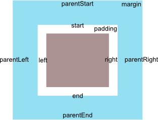
You can either specify a relative position like android:layout_toLeftOf="@id/...", android:layout_toEndOf="@id/..." or you can align the edges of the elements using android:layout_alignBottom="@id/..." or android:layout_alignStart="@id/...". You can also specify whether the element should align with the edges of the parent android:layout_alignParentTop="true". For a complete list of possible attributes read RelativeLayout.LayoutParams|Android Developers.
Providing Image Resources
Since I do not want a standard clock I exported my design of the hour, minute and dial from my SVG file and added them to the platform as drawable resources. To do this you simply copy the images, preferrebly as pngs, into one of the drawable sub-folder. The drawable can then be referenced in the layout by prefixing its name with @drawable/ in the src attribute.
<AnalogClock
        android:id="@+id/analogClock"
        android:layout_width="@dimen/analogclock_layout_width"
        android:layout_height="@dimen/analogclock_layout_height"
        android:layout_alignParentLeft="true"
        android:layout_below="@+id/clockLabel"
        android:dial="@drawable/dial"
        android:hand_hour="@drawable/hour_hand"
        android:hand_minute="@drawable/minute_hand"
        android:paddingLeft="1dp" />
It is also possible to reference the drawable from code. Android generates a static id named according to the image file name in the drawable section of the R file. This id can then be used to maniuplate the image in code.
Example showing how to set a image using a resource id
ImageView imageView = ...;
imageView.setImageResource(R.drawable.dial);
This code snippet will pick the image named dial.png and add it to the imageView.
The R File
Android generates ids for all resources so that they can be referenced easily in code. These ids are put in the R file which provides static fields for each resources in a namespace representing the resource type.
The res file structure:
res/
 |-- layout/
 |    |- clock_layout.xml
 |
 |-- drawable/
 |    |- dial.png
 |    |- hours.png
 |
 |-- values/
 |    |- string.xml
 |    |   |-> contains key:
 |    |         clock_label
 |    |
 |    |- dimen.xml
          |-> contains key:
                clock_width,
                clock_height
will result in the following R file:
public final class R {
    public static final class attr {
    }
    public static final class dimen {
        public static final int clock_height=0x7f050000;
        public static final int clock_width=0x7f050001;
    }
    public static final class drawable {
        public static final int dial=0x7f020000;
        public static final int hour=0x7f020001;
    }
    public static final class id {
        public static final int analogClock=0x7f080001;
        public static final int clockLabel=0x7f080000;
    }
    public static final class layout {
        public static final int clock_layout=0x7f030000;
    }
    public static final class string {
        public static final int clock_label=0x7f060002;
    }
    public static final class style {
        // ...
    }
    public static final class xml {
        // ...
    }
}
Supporting different Screen Sizes
Which drawable is loaded depends on the screen metrics of your device and the available resource selectors. Android will try to find the best match and scale it appropriately. Depending on which version of the SDK you are using you have different possibilities to provide the qualifiers for your drawable resources.
- drawable-ldpi designates a low density screen with 120dpi. This attribute was introduced in SDK Level 4.
- drawable-mdpi designates a medium density screen with 160dpi. This attribute was introduced in SDK Level 4.
- drawable-hdpi designates a high denisity screen with 240dpi. This attribute was introduced in SDK Level 4.
- drawable-xhdpi designates a very high denisity screen with 320 dpi. This attribute was introduced in SDK Level 9.
- drawable-xxhdpi designates screen densities with 480dpi. This attribute was introduced in SDK Level 16.
- drawable-xxxhdpi designates screen densities with 640dpi. This attribute was introduced in SDK Level 18.
- drawable-nodpi non scalable
- drawable-tvdpi from SDK Level 13 213dpi. This attribute was introduced with SDK Level 13.
- drawable-h<height>dp height of the screen in dp
- drawable-w<width>dp width of the screen in dp
- drawable-sw<height>dp the size of the shortest screen width in dp
Example file structure
|-drawable
|   |- test.png
|
|-drawable-w820dp
|   |- test.png
|
|-drawable-h240dp
    |- test.png
Defining Dimensions
The clock should have a certain height and width. I can specify this directly in my layout file but this would mean if I have to support other layouts where the height might have to change I have to provide an alternative layout file which only differs in the dimension of the analog clock. To make it possible to reuse the layout structure we defer the dimension declaration into the dimension resource which can then be provided for different layouts countries etc. This allows me to separate the structure of the UI from the actual dimensions.
<resources>
    <dimen name="analogclock_layout_width">120dp</dimen>
    <dimen name="analogclock_layout_height">120dp</dimen>
</resources>
To reference the dimension in your layout you simply use the prefix @dimen/ and specify the name of the dimension to use.
<AnalogClock
        android:id="@+id/analogClock"
        android:layout_width="@dimen/analogclock_layout_width"
        android:layout_height="@dimen/analogclock_layout_height"
        android:layout_alignParentLeft="true"
        android:layout_below="@+id/clockLabel"
        android:dial="@drawable/dial"
        android:hand_hour="@drawable/hour_hand"
        android:hand_minute="@drawable/minute_hand"
        android:paddingLeft="1dp" />
When specifying dimensions always try to be pixel independent. To ease this android provides device independent pixels dp for specifying pixel sizes and scalable points sp for specifying text sizes in a screen independent way. You might also see dip as the unit for device independent pixel but the preferred way is to use dp. dp and sp are always calculated relative to the actual pixel size so that the final dimensions remain the same relative to each other. On a high density display the actual size of 1dp can be 2.5px or 3px while on a low density device the same 1dp equals 1px. The android documentation says that on a 160dpi device 1dp = 1px. Always keep this in mind when designing your UIs and make your UI adaptive to different screen sizes to cover a broad range of devices.
 Be careful when checking the design on the emulator the actual screen always looks slightly different from the emulator due to the scaling factor on the emulator in relation to the screen of your development machine. As an example the text size on my actual phone looks slightly smaller then on the emulator making some of my text sizes too small on the real device.
Defining Text
Just as dimension are extracted into a separate file so are strings used in the layout. This allows to overwrite the strings for different languages without having to provide a language specific layout. For the current state of my widget I have provided the following string.xml file.
<?xml version="1.0" encoding="utf-8"?>
<resources>
    <string name="app_name">E34Clock</string>
    <string name="clock_label">Current Time is:</string>
</resources>
These labels are applied in the layout by referencing the corresponding string resource by its name prefixed by @string/.
<TextView
        android:id="@+id/clockLabel"
        android:layout_width="wrap_content"
        android:layout_height="wrap_content"
        android:layout_alignParentTop="true"
        android:layout_alignParentLeft="true"
        android:text="@string/clock_label" />
To provide a translation for the strings I simply have to provide a new resource folder with the appropriate ISO 639-2 language code attached with a hyphen. Since I'm providing a German translation I have to append the language code de to the folder name: values-de. I then simply add the string.xml file to this folder and translate all necessary values.
<?xml version="1.0" encoding="utf-8"?>
<resources>
    <string name="clock_label">Die aktuelle Uhrzeit ist:</string>
</resources>
When android inflates the layout it will try to find the best matching strings.xml and use its values. In case there is no specific folder it falls back to the default which in this case contains the English translation. This way I can internationalize my application by simply providing different strings.xml for the different language.
We can expand on this to incorporate L10N. For this we have to append the qualifier <r3166-alpha-2 ISO Region Code> to the folder name. Lets assume we want to provide a currency value for the United States, the United Kingdom, Germany and Switzerland. First we define the default strings.xml which in this case would be for Germany.
<?xml version="1.0" encoding="utf-8"?>
<resources>
    <string name="currency">100,00€ (EUR)</string>
</resources>
We can then localize this by specifying the folder for each country and providing the appropriate content for currency.
 |- values-rDE
 |    |- currency = 100,00€ (EUR)
 |
 |- values-rUS
 |    |- currency = $134.70 (USD)
 |
 |- values-rGB
 |    |- currency = £83.38 (GBP)
 |
 |- values-rCH
      |- currency = 123,21 SFr (CHF)
When necessary you can combine these qualifiers to specify localized translated values.
 |- values-en
 |     |- english translations
 |
 |- values-en-rUS
       |- english translations specific to the United States of America
Summary
The resource selection mechanism allows to specify different layouts for different orientations, screen sizes and languages. By separating the different aspects, - layout, text, dimensions, etc... - you can customize only the necessary parts of your UI. Although I have not shown it it is possible to use this for other resources (e.g. colors, menus) as well. You are not limited to using the selectors in layouts you can also refer to the resources in your code using the ids generated in the R file. All this together provides a powerful mechanism to publish your app for all android devices out there.
Running the represented code available from the FirstStep branch on Github results in

I hope you enjoyed this post and learned some stuff along the way. If you find any errors leave a comment or if you have questions just ask them. I would also appreciate it if you just give me some feedback in the comment section.
Outlook
Next post I will explain how we enable the widget in android and which meta data is necessary to activate the widget.
Resources
- App Resources|Android Developers provides an overview of how android handles resources and provide further links to trainings and tutorials regarding designing for multiple devices and screen sizes.
- Providing Resources|Android Developers has an overview on the qualifiers provided by android.
- New Tools For Managing Screen Sizes goes into the details about device independent pixels and the new screen size selectors available since Android 3.2.
- Layouts|Android Developers describes the use of layouts and gives references to the different layout types.
- ISO 3166-alpha-2 Region Code listing
- ISO 639-2 Language Code listing
Yours truely
Stefan Langer


